From Raw Logistics Data to Network Decisions
Learn how meado approached the problem of large-scale visualisation, as well as some key concepts which helps make the map what it is today.


With any logistics operation comes a vast amount of data. Shipments, customers, facilities, carriers, costs, delivery times and geographic information all contribute to a picture of how an operation is performing. At Meado, our priority is making this data accessible and useful, regardless of its size or the format it comes in. We want users to be able to move from raw operational data to meaningful insights and network redesign in a matter of hours rather than days.
Traditionally, software that provides these capabilities comes in the form of expensive desktop applications with strict system requirements and complex installation processes. Before a user can even begin analysing their network, they may need to install software, configure their environment, prepare their data and learn an unfamiliar system. This creates a significant barrier between the data a business already has and the decisions it wants to make from that data.
At Meado, we took a different approach. We built a web application that allows users to open their browser, log in, upload their existing data and begin visualising their network, analysing their operations and planning changes within minutes. The goal is not simply to move traditional logistics software into a browser, but to rethink what it means to work with large logistics datasets in the first place.
Starting with the data you already have
Consider two simple datasets: a locations file containing geographic information such as cities, countries, coordinates and population, and a shipments file containing the operational information associated with each shipment.
The shipments file might contain 50,000 shipments, with each shipment referencing both an origin and a destination. This means that even a relatively straightforward dataset can represent 100,000 geographic locations that need to be understood and visualised.
The first challenge is that the data is not necessarily structured in the way an application would ideally like it to be. The shipment file contains the operational information, but the geographic coordinates are stored separately in the locations file. Traditionally, a user would be expected to consolidate these datasets into a specific format before uploading them into a logistics application. This might involve manually joining spreadsheets, renaming columns, restructuring data and repeating the process every time new data becomes available.
We believe the software should adapt to the user's data rather than forcing the user to adapt their data to the software.
Instead, Meado allows users to create a data pipeline directly within the application. In this example, two simple joins can connect the origin and destination information in the shipment dataset to the corresponding geographic information in the locations dataset. The result is a new dataset containing all of the original shipment information alongside the coordinates required to visualise it.
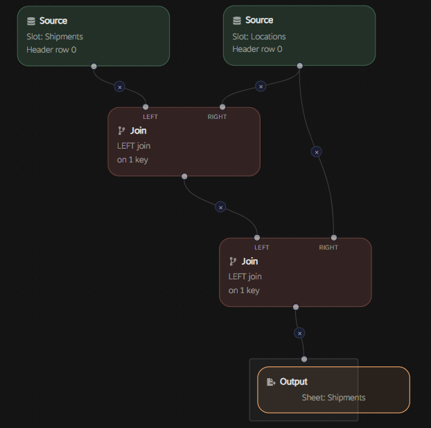
Once the pipeline has been created, it can be reused. For a logistics operation that receives similar files every month, the user can simply provide the latest datasets and run the same process again. What would traditionally be a manual data preparation exercise becomes a repeatable part of the workflow.
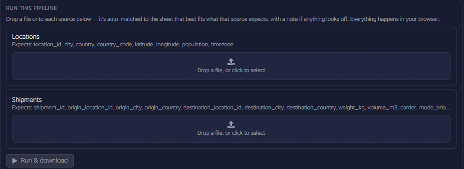
This is important because the value of a logistics platform should not depend on whether a customer has perfectly structured data. Real operational data is rarely perfect, and businesses should not have to spend hours preparing it before they can begin asking questions of it.
From 100,000 locations to a live network
Once the data is ready, the next challenge is visualisation.
Maps are fundamental to logistics because geography provides context that a spreadsheet cannot. Two rows in a table can sit directly next to one another while representing locations thousands of kilometres apart. Placing those same records on a map immediately changes the perspective. Geographic concentrations, gaps, corridors and relationships between locations become visible, allowing users to understand where their operation actually exists in the physical world.
This becomes significantly more difficult as the amount of data increases. Visualising a few hundred points in a browser is relatively straightforward. Visualising tens or hundreds of thousands of geographic objects while maintaining a responsive interface is a very different problem. A traditional web application might represent each point as an individual interface element, with JavaScript responsible for managing its interaction. As the number of elements increases, so does the amount of work required from the browser. The result can quickly become a map that feels slow precisely when the user needs to explore it most.
Logistics data also does not behave like a traditional web page. Pagination works extremely well for a table because users naturally move from one page of records to another. A map is different. The user might be looking at the entire world one moment and then zooming into a single city the next. Their viewport is continuously changing, and they expect the underlying data to respond immediately.
One solution is to only request the data currently visible within the map. While this reduces the number of points being rendered at any one time, it introduces another problem. Every pan or zoom can result in another request to the server, another database query and another round trip across the network. Instead of smoothly exploring the data, the user can end up waiting for the application to retrieve the next portion of the map.
Clustering provides another option by combining nearby points into a single visual representation. This can work well when viewing a large geographic area, but it also changes what the user sees. If a large proportion of the operation is concentrated in one region, thousands of locations can remain hidden inside a cluster until the user zooms significantly closer.
Neither approach fully addresses the experience we wanted to create. We wanted users to be able to work with their data rather than constantly wait for their data.
A different approach to large-scale visualisation
This led to one of the key architectural decisions behind Meado. Instead of treating the map as a traditional interface that continually retrieves small portions of information from the server, we designed it around the idea that the user should be able to interact with their dataset immediately and continuously.
Where appropriate, the data is made available to the application upfront and processing is moved closer to where the user is interacting with it. This reduces the dependence on repeated server requests and allows many of the interactions involved in exploring the network to happen directly within the user's browser.
The way the data is rendered is equally important. Rather than treating every location as an individual web interface element, the visualisation is designed to process and display large numbers of geographic objects efficiently as a whole. The browser is therefore being used not simply as a way of displaying a webpage, but as a high-performance environment for interacting with geographic data.
The result is that the size of the dataset does not have to dictate the experience. A network containing 100,000 locations can remain something the user can actively explore rather than something the application has to hide behind pagination, loading screens or heavily simplified representations.
This is what allows a user to move from uploading their data to exploring their network within seconds.
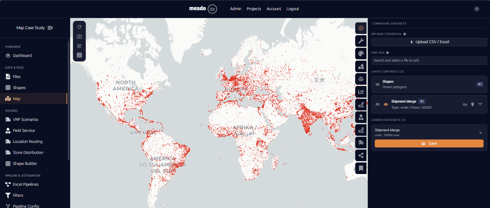
Turning a map into an analytical tool
The map is only the beginning.
Once the network is visible, patterns begin to emerge. Users can explore where their customers are located, understand the geographic distribution of shipments and investigate how different parts of the operation interact. Individual locations can also retain the underlying information associated with them, meaning that the map is not simply showing where something exists, but can provide context about what is happening there.
For example, a user can investigate which carriers are being used across different locations and understand how that distribution relates to their wider operation. They can examine shipment weight, volume, cost, delivery dates, priority and status without leaving the environment in which they are exploring the geography.
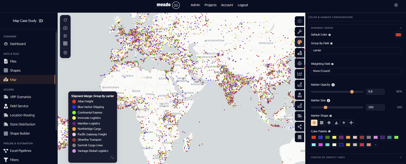
This is where the distinction between a map and the Meado platform becomes important. The map provides the geographic context, but the underlying dataset provides the operational context. Bringing the two together allows users to move naturally between understanding where something is happening and understanding why it matters.
Meado can then build dashboards around the questions that matter to a particular operation. Rather than forcing every customer into the same set of predefined reports, the platform can be configured to present the metrics and analysis that are meaningful to them.
In this example, we can begin with an overview of shipment volumes, costs and performance over time. From there, the data can be used to evaluate whether shipments are meeting the customer's 12-day SLA and identify where performance is beginning to deteriorate.
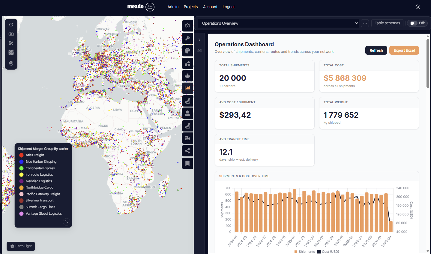
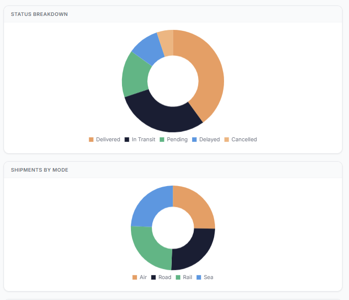
Looking at shipment status provides another layer of insight. If a significant proportion of shipments are delayed, the issue becomes immediately visible and can be investigated further rather than remaining buried within thousands of rows in a spreadsheet.
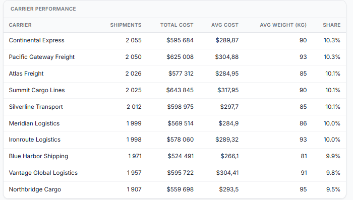
The same dataset can also be used to examine costs by carrier. This gives the customer a way to understand how much they are spending with each carrier and identify opportunities to adjust margins, review billing or potentially shift volumes towards more cost-effective providers.
What makes this particularly powerful is that all of these views are being generated from the same underlying operational data. The user does not need to create separate datasets for the map, the dashboard and the analysis, they are different ways of interacting with the same information.
From understanding the network to redesigning it
Once an operation can be visualised and analysed, the next question naturally becomes what should change.
In this example, the customer wanted to understand where they should establish ten new warehouses based on where the majority of their shipments were going. A heat map provides an immediate way to explore this question by showing where the greatest concentration of shipment weight and volume exists.
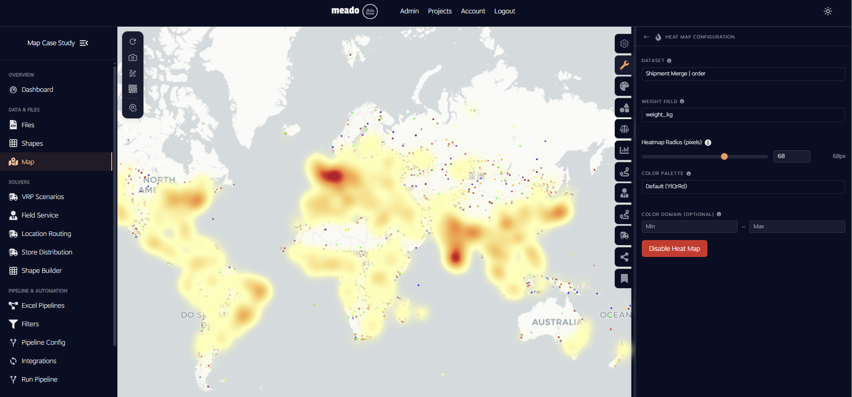
The geographic distribution quickly highlights significant activity across Europe, the Middle East and the east coast of North America. This gives the customer an immediate understanding of where demand is concentrated, but it does not by itself answer where the warehouses should actually be located.
This is where the analysis can move beyond visualisation.
Using the shipment data, Meado's Center of Gravity functionality can calculate locations that provide an efficient way of positioning new facilities relative to the distribution of demand. In this case, the ten resulting locations provide candidate positions for the customer's new warehouses based on the underlying shipment network.
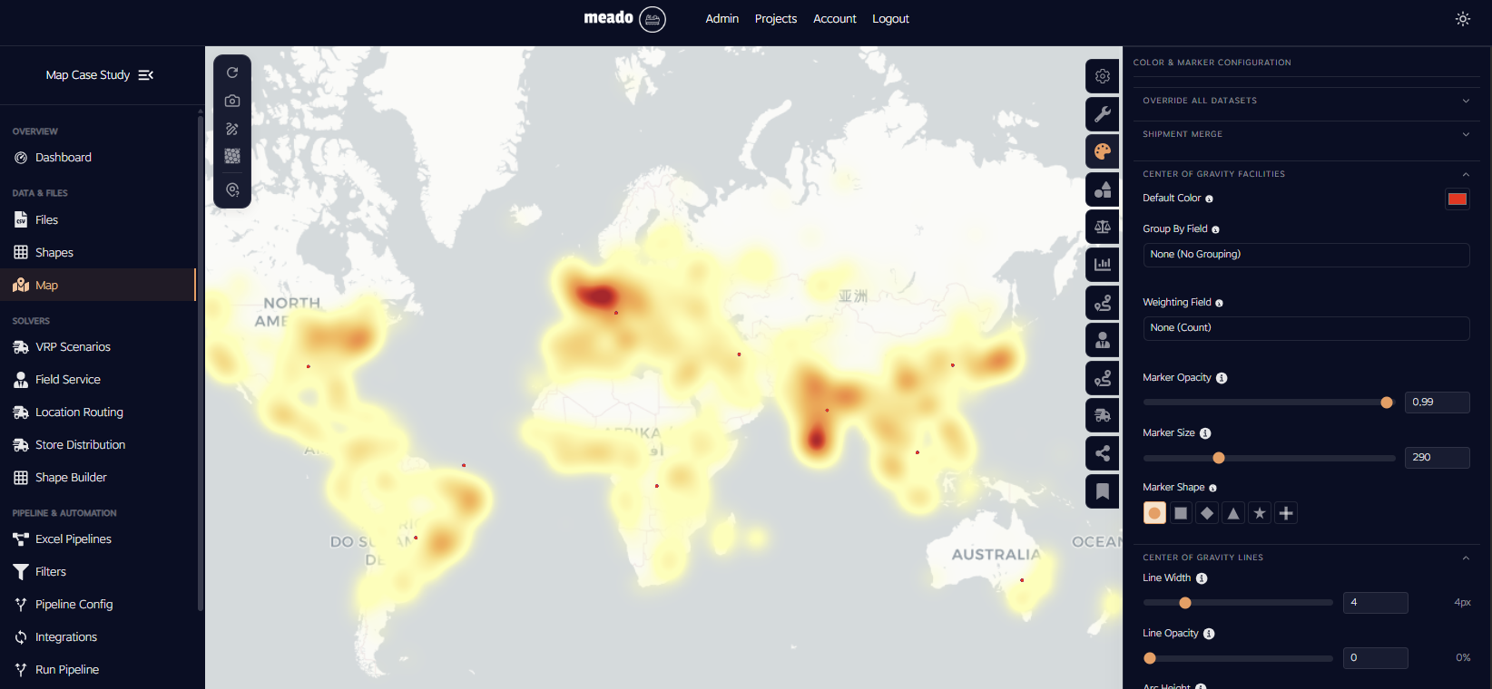
The important point is that the customer did not have to move their data into a separate application, manually export coordinates or build another analysis from scratch. The same data that began as two raw files has progressed through data preparation, geographic visualisation, operational analysis and network redesign within the same platform.
From raw data to a decision in minutes
What makes this workflow powerful is not any individual feature. It is the distance between the starting point and the final decision.
The process begins with raw operational data that was never specifically prepared for Meado. The data is connected through a simple pipeline, transformed into a usable dataset and visualised across a network containing 100,000 locations. From there, the user can explore the geography, investigate operational metrics, analyse carrier costs, identify service issues, visualise concentrations of demand and ultimately test where new facilities could be positioned.
In this particular example, the entire process from raw data to actionable insights was a roughly 30-minute exercise. With more time, the same dataset could be used to generate considerably more analysis, from carrier performance and geographic service levels to facility utilisation, cost optimisation and network redesign scenarios.
The point is not that every logistics question can be answered in 30 minutes. The point is that the barrier between having the data and being able to work with it has been dramatically reduced.
Meado is designed around the idea that logistics teams should not need to spend their time installing complex software, restructuring spreadsheets or waiting for large datasets to load before they can begin thinking about their network. The platform brings data preparation, large-scale visualisation, analysis and network planning into one environment, allowing users to move from raw data to an understanding of their operation and, ultimately, to decisions about what should change.
As logistics operations become increasingly data-driven, the ability to work with large datasets is not valuable simply because large numbers are impressive. It is valuable because it allows the full picture of an operation to remain available while decisions are being made.
That is ultimately what we are building at Meado: a platform that reduces the distance between raw logistics data and an actionable network decision, regardless of the size or shape of the data that a customer starts with.